|
|
Advanced WPF Forms |
|
|
Advanced WPF Forms |
WPF attempts to bring the best of rich-client technologies like Windows Forms, and layout techniques from the browser to give a high degree of flexibility when positioning elements on forms.
Rich client technologies like VB6 forms, Access Forms etc were based on absolute positioning. As a developer you specified the top and left values for a control to position it on the form. This allows for a fine degree of control, but often required a large amount of code to handle form re-sizing. This was an imperative approach to layout. Controls like Labels and Panels had no awareness of the size of the content inside them - for example if the content of a label was larger than what could be displayed in the label then the content is clipped, and not shown.
Web UI rendered in the browser typically require no re-sizing code. Instead HTML gives a declarative approach to the layout of elements. You specify a series of containers like <div> elements (or <table>, <tr> and <td> elements if you haven't become convinced of the benefits of positional CSS-based layouts) and position those by either floating them Left or Right, or positioning them absolutely in your page. Elements like <div> are aware of the size of their contents and will stretch to accommodate their content.
Both these approaches could be equally difficult to achieve the desired layout, although the declarative approach had the advantage of requiring much less code to do so. Recently windows forms has added concepts like Docking and Anchoring, adding a more declarative approach to rich-client development. WPF continues this trend with a declarative approach to layout based on the concept of panels.
Most UI elements in WPF can only contain a single child element - for example the following Xaml code fails to compile with the following error: "The 'Button' object already has a child and cannot add 'CheckBox'. 'Button' can accept only one child."
|
Sample Xaml Code |
|
<Button> <TextBlock>Some Text...</TextBlock> <CheckBox /> <ComboBox /> </Button> |
If the button allowed these two elements to be nested inside it, it would be responsible for laying them out somehow. Since there are many possible ways these items could be laid out the button would have to become a much more complicated control to accommodate them all, and would now have two "responsibilities" - allowing the user to click on it, and laying out content. Not only would the button become much more complicated but all the controls in WPF would become more complicated.
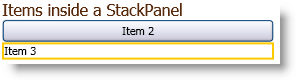
Instead of taking this approach the WPF team decided to factor out the responsibility for layout to a different control - panels. There are a number of different types of panels in WPF and each enables a different kind of layout. Panels can be nested wherever regular content can be placed, allowing a fine degree of control over the layout of items. For example to correct the problem in the example above we could nest a StackPanel inside the button, and position the elements inside the StackPanel.
|
Sample Xaml Code |
|
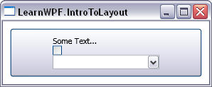
<Button> <StackPanel> <TextBlock>Some Text...</TextBlock> <CheckBox /> <ComboBox /> </StackPanel> </Button> |
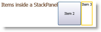
This give the following layout:
The beauty of this approach is that we can translate and expand each of these controls and the entire form will re-size to accommodate the translation. Consequently Microsoft WPF requires very little in terms of re-layout post-translation.
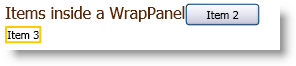
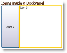
There are several types of Panels that are supported by WPF to create a rich and versatile GUI.
We can see from the different examples above that the different Panel controls not only influence the position of the elements they're laying out, but also their size. Consequently, many WPF applications will re-size automatically during translation and require minimal engineering post-translation.
| (c) Copyright Alchemy Software Development Ltd. |  |